The goal of this project was to develop a tool for visual data quality diagnostics for analysts working with very large movement datasets. The tool works by producing a clear visual summary of travel duration, distance and frequency patterns present in the data, which then help the analyst clean the dataset, select an appropriate analytical model, verify model assumptions, etc. You can find me talking about it at length in the attached conference recording (see the very end of the page), but a few key examples are highlighted in this post.
The figure below is a sample visual summary of travel records reconstructed from 80 million geolocated tweets collected over one month across the contiguous US (close to 100% of all tweets sent). There are plenty of “shapes” visible in this summary, e.g. large clusters in the middle and in the upper-left corner of the chart.
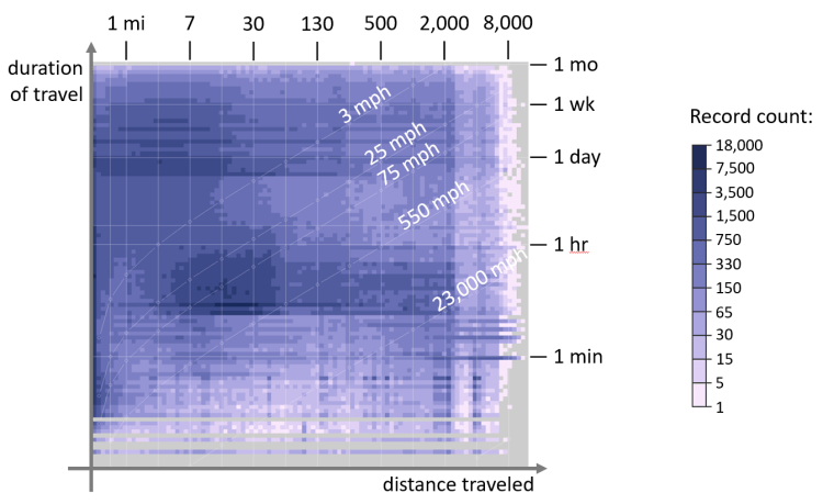
Right away, this figure highlights some amusing data artifacts — notice the diagonal line with a “550 mph” label. Since figure’s axes correspond to the duration and distance traveled, a “free” data dimension encoded in the chart is the speed of movement. Notice how plenty of “travel” happened at speed above that of commercial airliner, i.e. 550 MPH? Those are geocoded tweets from weather stations, automated earthquake warning systems and other similar entities “masquerading” as movement data — something an analyst might want to exclude from their migration model.
Besides coarse filtering, this overview can help with more nuanced data diagnostics. For example, large clusters in the middle and in the upper-left corner of the chart (highlighted below in yellow) look appealing and warrant further investigation.

According to the chart axes, the upper-left cluster corresponds to daily trips of 15 miles or less — perhaps daily commute, as seen on Twitter? The cluster in the middle, however, has puzzling movement statistics — it is composed of tweets sent while traveling at about 75 MPH. Reading through a short data sample from both clusters provides a hint — although “tweeting and driving” cannot be ruled out, the central cluster appears to be primarily composed of advertising messages (85%), with ad bots “tagging” specific ads with city names and other location data, i.e. just another source of noise in the data. The upper-left cluster, on the other hand, is primarily composed of human chatter, with only 10% of ads, and is likely a better candidate for further analysis.
Also, due to the simplicity of the visual metaphor used, this chart can be easily augmented with movement meta-data. For example, shown below in shades of green is the number of unique users observed in each cell of the overview chart. In a way, it’s comparable to the concept of sample size — it tells you how many unique Twitter users contributed data to whatever pattern you found in the overview chart. If avoiding bias from “super users” (users that generate a disproportional amount of data) is an important consideration, it might be best to use data from dark-green areas of the chart.

To avoid mental arithmetic, the chart showing the number of unique users can be combined with the “original” visual summary of this dataset to show data volume per user. Shown above in shades of pink, it shows a clear spike in “super user” density towards the middle of the chart — that’s the advertising “cluster” identified earlier. Nifty!
If you’d like to learn more, you are welcome to watch me discuss all of this in detail at a recent NACIS conference:
