This project is an outcome of my work with multiple independent teams of analysts that shared a common objective — analysis of very large movement datasets. Each of the teams was looking to build a sophisticated data model within their own domain (cross-border human migration, impact of natural hazards on mobility, pandemic travel disruptions), but was wary of committing resources to the project without first “peeking” at their data to confirm its fit for the task.
The challenge, however, was that off-the-shelf movement visualization tools did not scale well (with smallest datasets exceeding 100 million records), and development of custom visualization tools fell outside of teams’ core skill sets. With this in mind, I set out to develop a low-commitment, low-barrier-of-entry tool for rapid visual ideation with movement datasets of unlimited size.
Although showing unlimited amount of data is not a trivial proposition, there are two specific design choices that made it possible in this specific situation. First, the data file is formatted as a chronological sequence of movement records, each roughly equivalent to a statement “entity A arrived to point B from point C at a time D”. These records are then consumed one at a time, drawn on the screen and immediately discarded to avoid running out of memory. The second key choice is the use of raster surface for visualizing the data, where each movement segment is drawn on a raster canvas and immediately forgotten, to be later plotted over by newer data records — again, to avoid running out of memory due to keeping track of all segments drawn so far. A good metaphor for this architecture is an endless magnetic tape being fed into a VHS, with the data shown on an attached “TV” — the length of the tape does not matter, and the user can “scrub” back and forth at any speed they like.
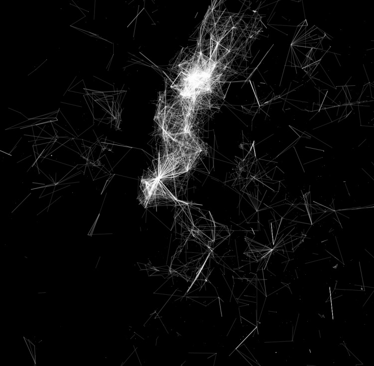
Despite its simplicity, the tool proved to be very effective. Designed as a multi-threaded Java app (using Processing as the rendering library), it uses CSV as the file format and is readily portable to most application domains and platforms. Shown in figure below are static “screenshots” of the tool in action, showing human mobility patterns derived from 120 million geolocated tweets. The left part of the figure shows Manhattan (“as seen on Twitter”), whereas the right part mapped US-wide movement patterns.

Naturally, a tool designed for exploratory visualization of movement comes through best when viewed viewed live, which you can do in a video attached below. This video accompanied a short paper (“Visualization of Massive Movement Datasets with Low Barrier to Entry – A Case Study“, see here) that summarizes many more technical details about the tool, including the pseudo-code for my visualization algorithm.
