This post is a very abridged summary of my involvement with SensePlace (v. 2 and 3) — a large, four-year-long project sponsored by the USACE Research and Development Center. As part of a broader DHS initiative for excellence in visual analytics, USACE sought a contractor to develop visual analytics methods, tools, and applications for building situational awareness in natural disasters and other emergency events. The resulting product was intended for use by USACE and its local, statewide, and national clients, and generated a plethora of research papers and information products, some of which are listed at the end of this post.
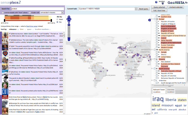
The key objective of this project was to build custom web-based dashboard tools for real-time analysis of social media data produced by the general public in the event of a natural emergency. For example, a major flooding event can generate hundreds of thousands of pleas for help on Twitter, with people reporting stranding, power outages, food and water shortages, etc. The design of SensePlace (the use of real-time data streams, natural language processing models, and interactive data visualization tools) was specifically tailored to bring rapid insights about highly-localized events to the emergency analysts. You can see a static rendering of the main system interface in a figure below, with its components (query box, interactive timeline and map, and wordcloud) populated by data for a specific query.
As the lead data visualization developer on this project, I participated in iterative rounds of design requirements’ collection, developed interface mock-ups and prototypes, designed the overall front-end architecture, implemented custom web-based visualization tools and coordinated the work of other front-end developers. One of the core components of the resulting system that I put in place is an advanced coordination architecture that enabled SensePlace visualization tools to interact with each other seamlessly (and provided for modularity and pain-free incremental development over lifespan of the project). You can see the coordination mechanism in action in the video below — notice how selecting data in any single interface component causes other views to react accordingly, filtering and highlighting related records, as needed.
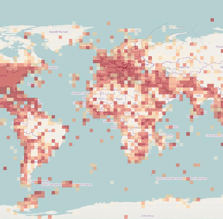
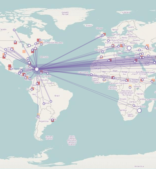
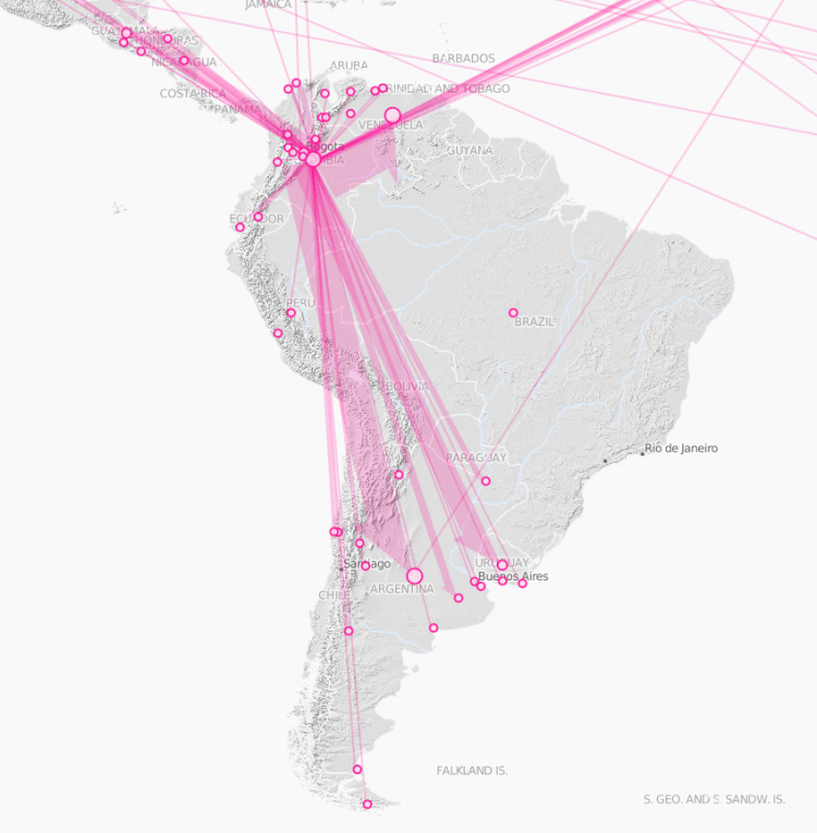
Besides advanced data filtering and interaction mechanism, this project prototyped a variety of spatial data visualization metaphors. The map component (seen in the center of the figures above) changes its shape depending on the specific type of analysis. The figure below shows three specific map types — starting from the left, a heatmap to show data availability for a specific query (with denser color implying more spatial data available), a place-link chart to show people engaging with an event (an earthquake in Haiti) across different parts of the world, and an information propagation chart showing the spread of information across social media during a soccer match (with the width of the arrows showing the volume of retweets). These charts required custom visualization component development as most web mapping APIs do not support advanced cartographic metaphors used — a major feat!
As I mention at the beginning, this post is a very abridged summary of four years of intense visual analytics work. You are welcome to read more about the coordination architecture I developed (“Multiview User Interface Coordination in Browser-Based Geovisualization Environments”, e.g. here), the overall system architecture (“SensePlace3: a geovisual framework to analyze place–time–attribute information in social media”, e.g. here), or the interface design and evaluation work I have done for SensePlace (“Advancing the Theory and Practice of System Evaluation: A Case Study in Geovisual Analytics of Social Media”, e.g. here).
