One of the key differences between data visualization and visual analytics is that the latter links visuals to advanced algorithms, in the hope that the union of the two would help make deeper discoveries than either visualization or data modeling alone. This project attempts to do just that, by building a tool for analysis of complex network datasets that combines a powerful visual metaphor (a reorderable matrix) with a powerful data-mining technique (heterogeneous information network mining, see an introduction here).
The choice of the visualization and analytical techniques above is not accidental. Reorderable matrix is an intuitive way to show that some entities (people, hashtags, purchases, etc.) are related to each other, whereas heterogeneous information network mining (HINM) is a flexible framework that can be used, among other things, to define what it means for entities to be related.
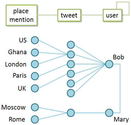
One of the core concepts of the HINM is the meta-path — a formal representation of a particular relationship. Consider the figure below, that shows a simple network of entities — two travel bloggers, Bob and Mary, and an assortment of tweets they wrote that summarize their travels to different places. This mini-network can be mined for tourist destinations that appear related, in order to drive travel suggestions for other eager travelers. But what does it mean for places to be related? In the figure below, we can, for example, ask “what places were mentioned along with London”, and satisfy ourselves with the query results. But we could also ask “if a person mentions London on Twitter, what other places have they talked about?” These two questions represent valid, yet different, forms of association between place mentions, and could be encoded as two distinct meta-paths (i.e. ways to “walk”) across our tiny network: place mention — tweet — place mention, and place mention — tweet — user — tweet — place mention.
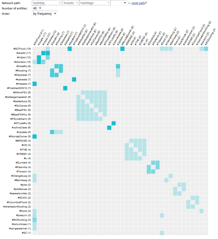
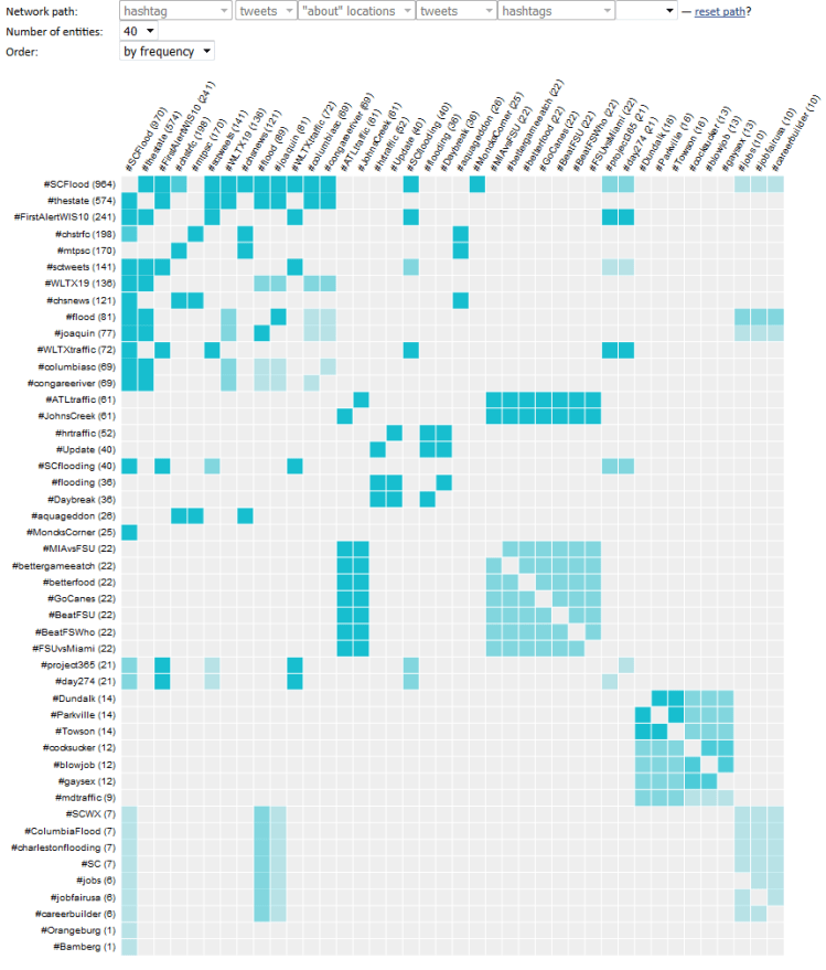
When applied to a realistic dataset, the reorderable matrix + HINM combination becomes a potent pattern detection tool. For example, the figure below shows an attempt to identify and group hashtags that can be used to monitor an unfolding emergency (a series of major floods in South Carolina, as captured in Twitter data). The matrix on the left shows the initial attempt at analysis, where hashtags are shown as related when they are mentioned in the same tweet (notice the meta-path at the top). The matrix on the right shows hashtags as related when they refer to the same place (again, see the meta-path on top). The second attempt is clearly superior — notice the surge in the volume of connections identified between the hashtags.
Although HINM is a well-established technique and is known to work really well, the final objective for this project was to demonstrate that it can work well in the hands of a layperson. Although the full details of the user study that accomplished this objective are a bit much for a short blog post, the core finding is that the use of an intuitive visualization metaphor (i.e. reorderable matrix) as a proxy to the HINM analysis eliminates most hurdles associated with its use, and a simple 10-minute tutorial was sufficient for the analyst to start actively using the tool. Perhaps unsurprisingly, this is entirely in line with the opening thesis of this post — a visual analytics approach appears more capable than a purely visual or a purely algorithmic approach alone!
If you’d like to read the study summary in detail, check out the full project paper (“Augmenting geovisual analytics of social media data with heterogeneous information network mining — Cognitive plausibility assessment”, e.g. here).
