This project was borne out of my collaborative work with fermented landscapes researchers (i.e. geography of alcohol) — and it proved to be a lot of fun! The challenge that my collaborators faced was that traditional consumer research (e.g. regional brand or taste preferences, evolution of consumer preferences through time) is expensive, laborious and time-consuming, and requires extensive use of surveys and interviews. In the age of BigData, it is tempting to think if an alternative methodology is possible, one that is cheaper and easily scalable, yet still reveals meaningful patterns to the analyst. The key objective of this project, therefore, was to design and test a prototype pipeline for collection, visualization and analysis of crowd-sourced data capturing spatio-temporal patterns in beer consumption across the US — a virtual pub crawl of sorts.
We started by evaluating data availability and Terms of Service limitations for a number of alternative data sources (e.g. Twitter and Untappd), and picked BeerAdvocate — a well-established forum for beer aficionados to share their take on their products of choice. My collaborators then synthesized a list of seven candidate brands (beer labels) of interest to them. Armed with this list, I put together a web-scraping infrastructure that collected about 800,000 (16 years worth) of consumer reviews from BeerAdvocate, and used custom visualization tools to map the evolution of consumer preferences for these labels across space and time.
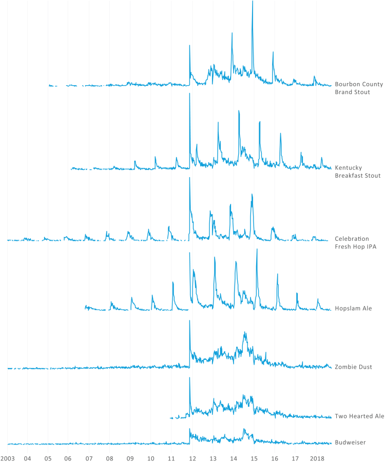
The figure below shows the temporal patterns of consumer interest for those seven labels. Although there are quite a few trends visible, one of the core findings that persuaded my colleagues in the validity of this approach is the presence of clear seasonality patterns for seasonal beer labels — notice the repeated seasonal spikes that coincide with yearly product releases. Non-seasonal beer labels (towards the bottom of the chart) lack such regular spikes and provide a baseline for comparison.
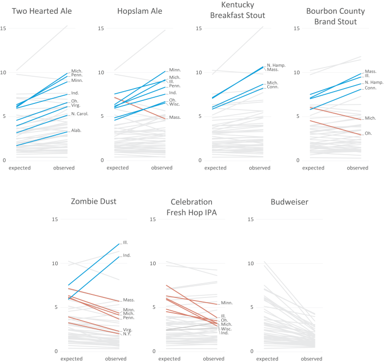
Regional patterns also come through quite clearly in the resulting dataset. The figure below shows a collection of slope charts, one chart for each beer label, that illustrate their popularity across the US. In each of the charts, a single line corresponds to a single state, and ascending and descending lines correspond to states with disproportionately high and low interest in the beer label in question. If you have a knack for detail, the numbers on the vertical scale correspond to the number of reviews per 100,000 people, and color is used to highlight states with most pronounced and robust preferences for a particular beer label. As before, this chart was in agreement with my colleagues’ expert opinion on expected patterns of beer consumption — see, for example, Zombie Dust chart, where you can see a strong consumer base in Illinois and Indiana, and a depressed amount of interest pretty much everywhere else, indicating a very regional label.
The figures above summarize some of the core findings of this project, but there is plenty extra, including a qualitative analysis of consumer reviews (using qualitative data coding methodology) and a comparison of patterns found in a different datasets (it turns out, reviews on Twitter are quite different from ones on BeerAdvocate). You are welcome to read the full paper about this project — “Virtual Pub Crawl: Assessing the Utility of Social Media for Geographic Beer Research in the United States”, e.g. here.
